Balancing the world
of Hospital Management
with Simplicity
Client
HOPs Healthcare
Industry
Healthcare & Pharma
Services
Brand Experience | UI/UX Design
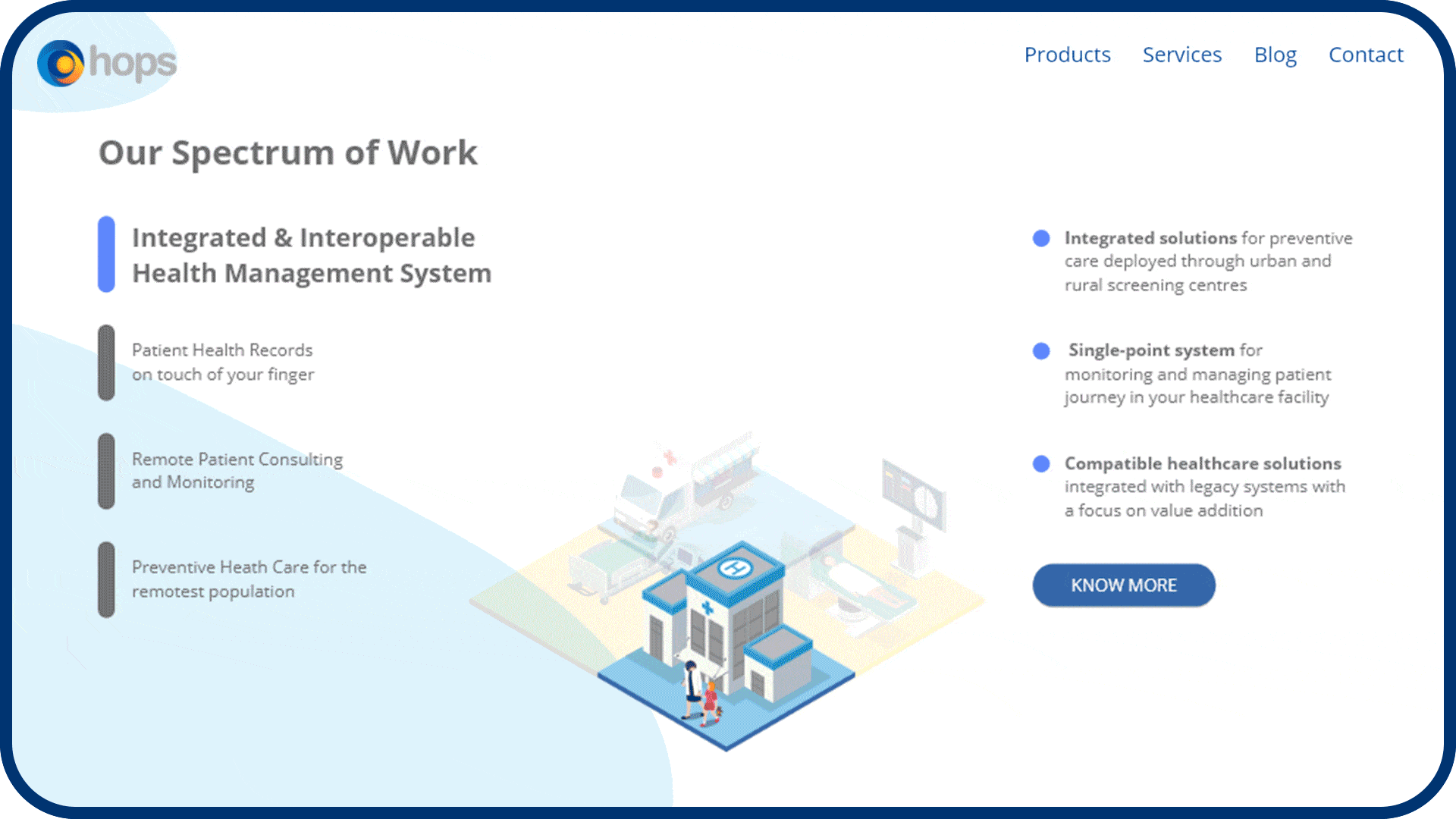
Repositioning a health brand through
UX, content, and service
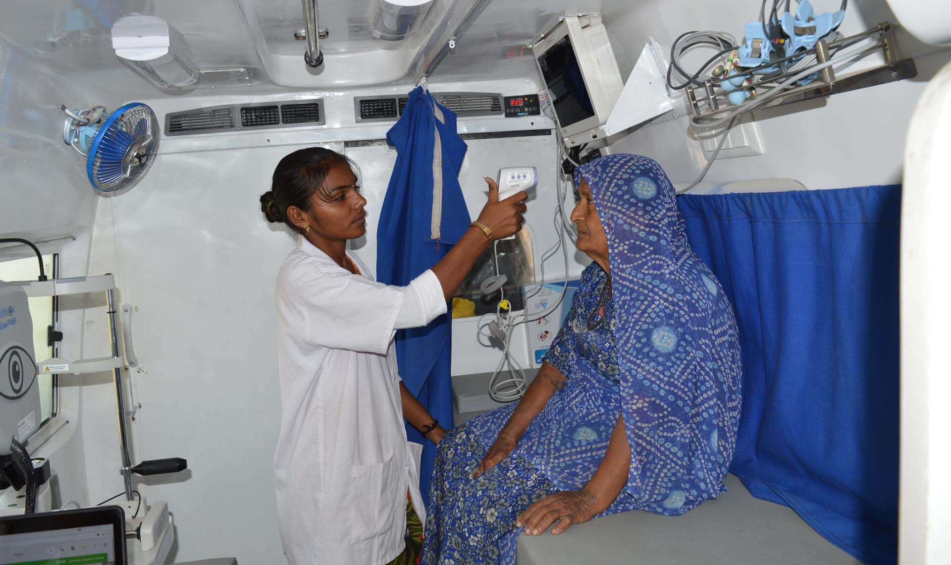
With over 10 years of experience since the inception of the brand under its parent company SLK TECHLABS PVT. LTD., HOPS network provides value-based infrastructure, services and platform-based solutions for the health industry across the globe.
While the logo was created inhouse at Hops, we took all steps necessary to reposition Hops by changing the user experience on their website. We helped redefine the way the brand speaks, appears and enabled them to engage with their audience with simplicity.
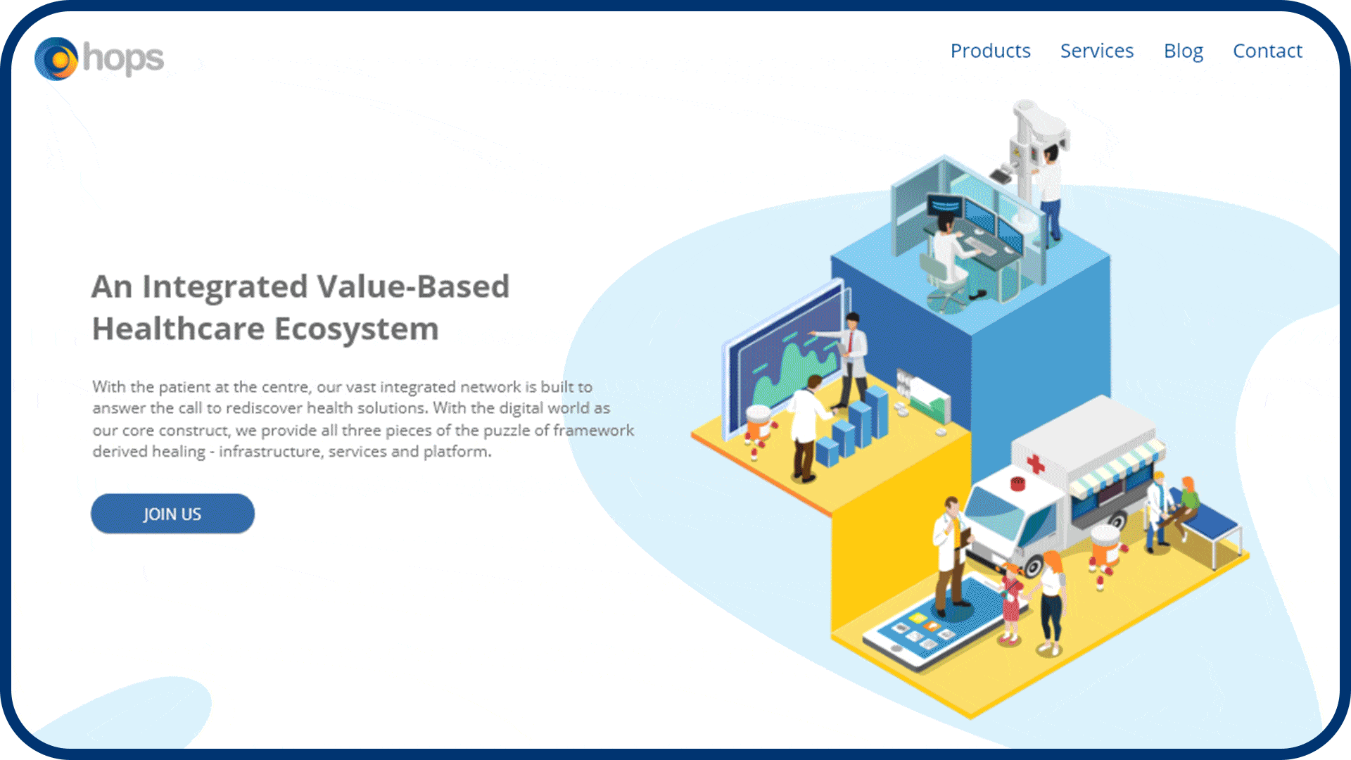
Design with a purpose
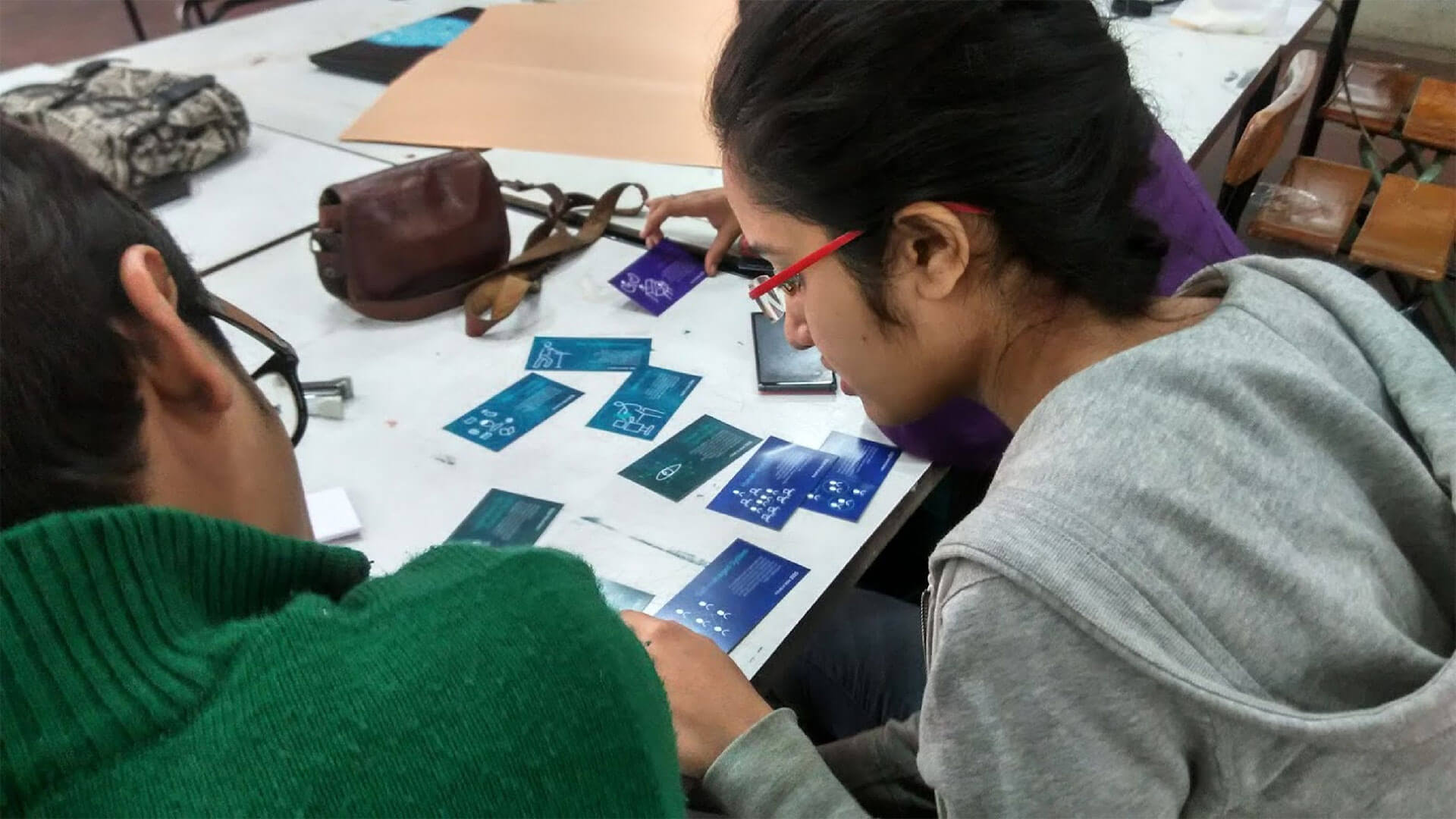
First Milestone for our work with HOPs was to create a Brand Language that stands out yet is so simple for all to understand with the right balance of UX, content and visual design.
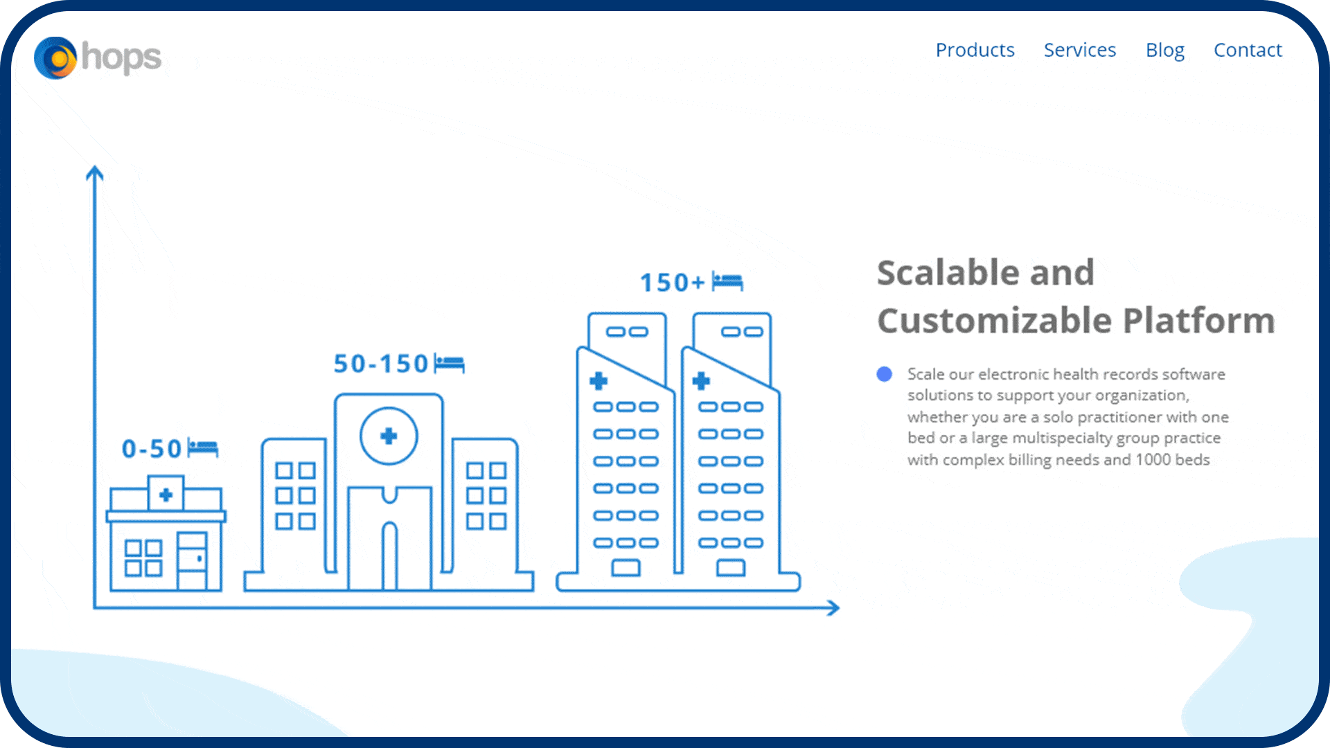
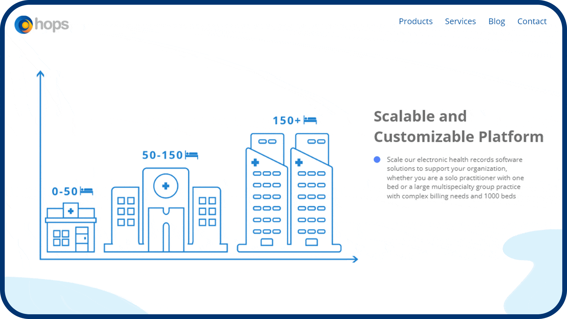
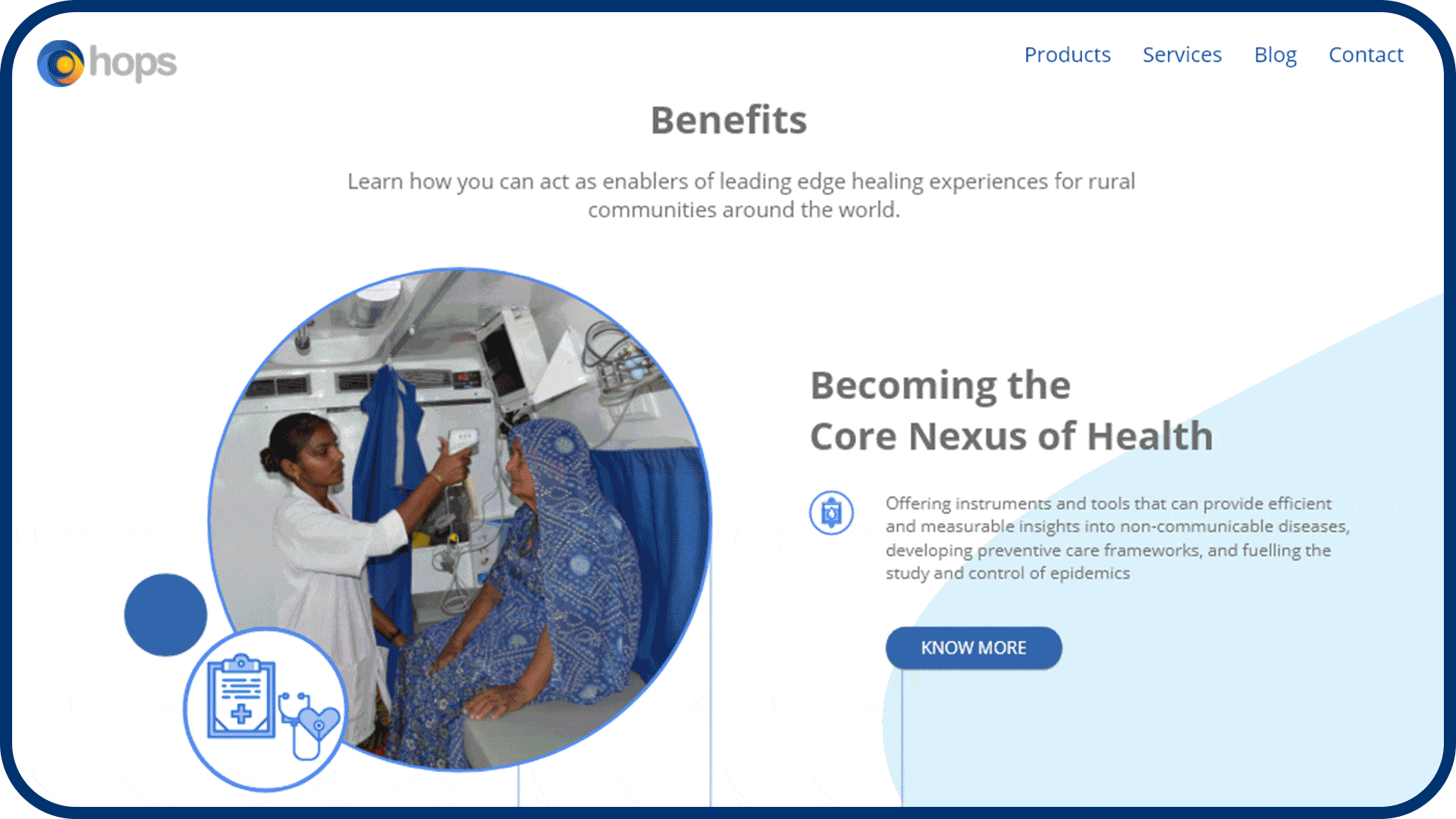
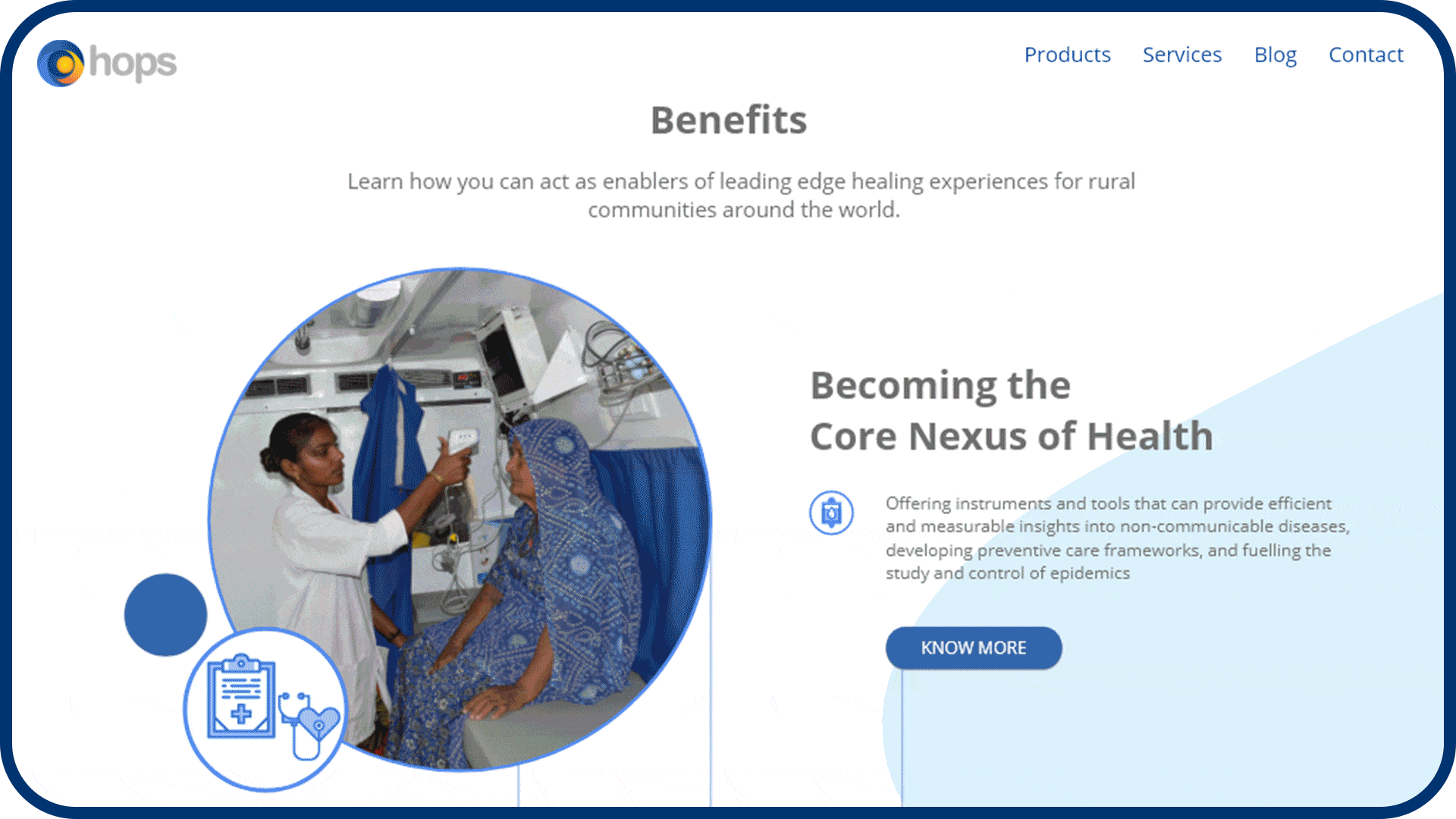

A holistic experience was created through a new visual language by taking inspiration from their original logo as well as imbibing various services provided by them. A new look was created with the energy of yellow and calmness of blue for healthcare.
- Hex: #3468A4
- Hex: #449AC1
- Hex: #8DCEF1
- Hex: #DBF2FC
- Hex: #F1873E
- Hex: #FCC610
- Hex: #FFE269
- Hex: #707070
Interconnected services
streamlined with design
-
Check out some of our other thoughtfully crafted work
-
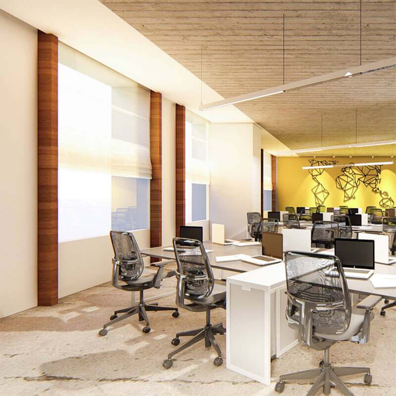
An office with a personality
Interior | Furniture Design -
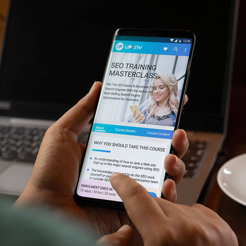
Physical meets Digital in the world of Education
Brand Experience | UI/UX Design